Showing posts with label Color. Show all posts

Monday, July 4, 2011

A Quick Forecast

As most designers will tell you, knowing what is going to be in style in future seasons is very important to the success of a line. In college we had access to WGSN, short for the World Global Style Network, which basically forecasts everything- colors, silhouettes, fabrics, prints, accessories, etc. Since graduating I've still, by some miraculous gift from the gods, been able to access WGSN which is infinitely priceless because I've been able to accurately forecast all of the above things for my Spring/ Summer 2012 capsule collection. The silhouettes have been finalized, as of about 15 minutes ago, and now it's just a matter of finalizing the colors and fabrics. My color palette is based off of Rihanna's Only Girl (In the World) video with what I like to call electric pastels.


I knew I wanted to use these colors early on and the forecasting confirmed they would work out. Now it was just a matter of figuring out which prints and fabrications to use. Luckily for me florals, vintage prints, stripes and all things kitschy are on trend for Spring/ Summer 2012. So immediately I started scouring Etsy for a little inspiration and I found some amazing stuff. We'll see what makes the final cut but I think this is an amazing start! Happy 4th of July!


From top to bottom: Screen Printed Vintage Silk from EmilyMe, $55; Blue Floral Linen from admiredhistory, $23; Purple Floral from LittleCabinVintage, $14.50; Pink and Orange Floral Knit from thriftypyg, $15.

Monday, June 27, 2011

A City Made Prominent By This Medieval University

WHAT IS OXFORD?! And you know what Alex Trebek would say? Chelsea, that is correct.

There is something both feminine and masculine about oxfords that I adore. The shoes that is. Now, I have no idea what the difference between oxfords and saddle shoes are but I, personally, think they're all the same so please bare with me shoe aficionados, this is just a fashion blog.

My obsession with oxfords began a few days after I moved to New York City when my friend Olivia's sister Amanda took me with her to Garden State Plaza in New Jersey and we walked into an Aldo. I had always thought Aldo was kind of a joke but they really do have amazing shoes and their ad campaign is shot by Terry Richardson, who is by far my favorite fashion photographer.

Basically I bought myself a pair of simple black matte oxfords that I wore until the heels and soles were falling off. In April, my Mom came to visit and bought me a brand new pair of shiny black oxfords from Nine West which I have already worn out in the three months I've owned them. The time has come for me to purchase new oxfords and while I feel like I should just go to Soho and get a crappy $25 pair since I know how fast I'll tear through them, I can't help but fall in love with the Bass Loves Rachel Antonoff collaboration. Here are my favorites for you to enjoy as much as I did!


From top to bottom: Lady in Cream/ Black, $109; Alice in Navy, $129; and Odette in Cream/ Red, $109.

Wednesday, February 2, 2011

Sofia Coppola Inspires!

I realize it's been a while since I've posted anything about my fashion life but I'm back now and my new topic of inspiration is Sofia Coppola. Personally, I feel there are only a handful of directors that are completely hands on when they do a movie i.e. writing, producing, casting, directing, etc. Not only do I love the way her films portray young women and exactly how they feel, I especially love her distinct color palettes. Marie Antoinette is a perfect example of this:
As is The Virgin Suicides:
And with Lost in Translation:

Lately I've been obsessed with Sofia Coppola movies and the topic of distinct color palettes is particularly relevant to me right now because the Spring/Summer 2012 line I'm developing is going to have the strongest color palette I've ever worked with.

Pictures to come soon!

Friday, September 24, 2010

Moschino May Be From Italy...

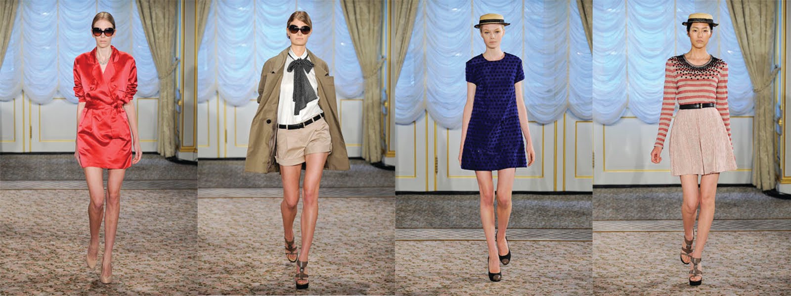
... But I want to run down the streets of Paris in nearly all the Moschino Spring/Summer 2011 collection! Moschino is known for being fun and flirty and I feel like this collection really represented so many parts of my design aesthetic: primary colors, polka dots, stripes, a-line skirts, and belts; it's like an amazing pin-up dream! Beloved pieces below!


Monday, July 19, 2010

A Fall Preview Indeed

The Fall Preview 2010 issue of V magazine is proving to be an excellent issue indeed. While I haven't seen it in its entirety in print, I have seen many of the spreads in digital form via their website. This issue is one you may have heard a lot about because this is the issue in which five models (Adriana Lima, Isabeli Fontana, Natasha Poly, Lily Donaldson and Eniko Mihalik) each have their own cover with strategic parts of their body covered by a scratch-off V.

Above: The issue I bought with Isabeli Fontana on the cover looking crazy fierce!

I graduate this quarter and my obsession with pin-up girls is going to be the focus of my portfolio booth when I present my work at Benaroya Hall in September. The spread below named "A Woman in Full" is a big part of my inspiration for an extra line I'm designing which will focus on creating clothing for a modern and sophisticated pin-up girl.

The color palette, the hair and makeup, the poses of the models as well as the type of undergarments which make the silhouette is what makes these pin-up inspired pictures so representative of that era.

Thursday, July 1, 2010

Gettin' Around Town!

Lately, in many a recent fashion publication, I have seen some adorable Miu Miu dresses that I haven't been able to locate in any of their fashion shows. In any case this collection (which ever it came from) seems very Easter inspired with pastel colors and applique flowers and tons of loveliness!


Above (from left to right): January Jones in C Magazine, Lily Allen for Elle UK, and Carey Mulligan at the Met Costume Gala.

Thursday, June 17, 2010

A Pairing for Style Champions

It's amazing the kinds of things you discover as you slowly finish finals and have this weird thing called free time. Like today I had time to go to Style.com and check out more Resort 2011 and fell in love with Proenza Schouler's collection. Later, my browsing brought me to Osborn, a company that makes shoes out of recycled materials. And in a wacky and crazy turn of events, the two go together perfectly! Both include ethnic inspired prints (something included in my senior collection) and remind me of something you could buy in Tijuana... and I mean that in the best way possible.

Gorgeous Givenchy

One of my first looks at the Resort 2011 collections brought me to Givenchy. The limited color palette of black, red, white and leopard really drew me in and I actually think it made the interesting designs stand out more with those few colors. I especially loved the jodphur pants and sheer skirts.

Photos via Style.com

Wednesday, June 9, 2010

Nautical! Wu!

Hello all 7 of my readers! My posts have been few and far between and I apologize. But for those of you who love pretty nautical inspired clothing here is a treat for you! Jason Wu (you know, THAT GUY I MET LAST POST) designed an ADORABLE Resort 2011 collection and while some of it was part Mississippi riverboat inspired, my favorite was the sailor, red-white-and-blue garments. Here are my favorites for your viewing pleasure:

Thursday, February 4, 2010

Hearts I'd Like to Steal

While flipping through the February issue of all the magazines I subscribe to, each has a Valentine's day spread of things with hearts and things that are red and pink that you should get for your sweetheart. Upon a heart based search of my own I found some cute little things I'd like for Valentine's Day. BOYS TAKE NOTE.


Above (left to right): Marc Jacobs silk twill heart top, Juicy Couture Love You heart sunglasses, Dior Joaillerie heart ring, and Leifsdottir Queen of Hearts silk skirt.

Thursday, January 7, 2010

A Love for Tim Burton Colleen Atwood

Yesterday, my Tim Burton obsession manifested itself. Today I figured out why exactly all the costumes were so, I don't know, enchanting? It's because each of his movies, the ones that I really like anyway, have the same costume designer behind them, Colleen Atwood.

I basically just spent the entirety of Edward Scissorhands looking for pictures of costumes from all my favorite Tim Burton movies (Beetlejuice not included because of today's previous post). For the sake of my OCD I'm going to put the pictures in chronological order. Because I know you needed to know my thought process. Heh.

First off we have Edward Scissorhands:

The color palette in this movie was particularly stellar, in my opinion. I love all the bright colors pulled right out of the sixties. It was an awesome contrast to Edward Scissorhand's dark leather suit. But in terms of silhouette, it's very eighties which is probably why I love this movie.

Next up is Sleepy Hollow:

What I really liked about these costumes was that their silhouette was very nineteenth century, but the colors and prints were otherwise. Very Tim Burton sort of colors and prints, if yaknowhaddamean.

Then we have Big Fish:

Almost all the costumes are pure magic, but according to the styles I love most, Sandra Templeton's are my favorite. Fifties silhouettes and two of my favorite color combinations: red, white, and blue and blue and yellow. Also, the small details are very apparent (more so on the film than in the above pictures) like the dots on the Ping and Jing's costume and general choices in trims and embellishments.

And lastly, Sweeney Todd:

Not one of my favorite Tim Burton plot lines BUT the casting and the costumes were impeccable. I think the time period for this movie is the same as Sleepy Hollow because some of the costume choices are very similar. This movie's costumes are very neutral, lots of browns and greys but when there is any amount of a real color, it stands out. I think that right there shows how powerful a strong color palette can be.